From the interlocking “NY” of the Yankees to the roaring Panther of Carolina, American sports team logos are more than colorful patches on apparel—they are miniature billboards of history, geography, and culture. Each stitch and hex code carries a narrative that often predates the franchise itself, quietly shaping how fans see their heroes and their hometowns.
Begin with baseball, the national pastime. The classic “Old English D” on the Detroit Tigers’ cap dates back to 1904, when the city’s booming auto industry wanted a mark that looked as solid as the steel being welded on factory floors. Designers chose a Gothic typeface to echo the toughness of assembly-line workers; over a century later, the same letter signals both automotive heritage and summer nights at Comerica Park. Across the American League, the Baltimore Orioles revived their smiling cartoon bird in 2012 after fans campaigned that the 1960s logo—lighthearted and childlike—matched the charm of Camden Yards better than the ornithologically correct version used in the 1990s. Here, nostalgia beat realism because supporters linked the cartoon to the last era when the team won the World Series.
Football logos carry tribal energy. The Kansas City Chiefs’ arrowhead, introduced in 1963, appropriates Native American imagery yet frames it within a modern “KC” monogram. Critics debate cultural appropriation, but the franchise argues the design honors the heritage of former mayor H. Roe Bartle, whose nickname “Chief” inspired the team moniker. Meanwhile, the Philadelphia Eagles’ midnight-green wing has evolved from a docile perch in 1933 to an aggressive swoosh today, mirroring the city’s shift from sleepy industrial hub to brash, tech-driven metropolis. The curvature of the wing even aligns with the angle of the Ben Franklin Bridge, a subconscious nod that locals swear they can see on game day.
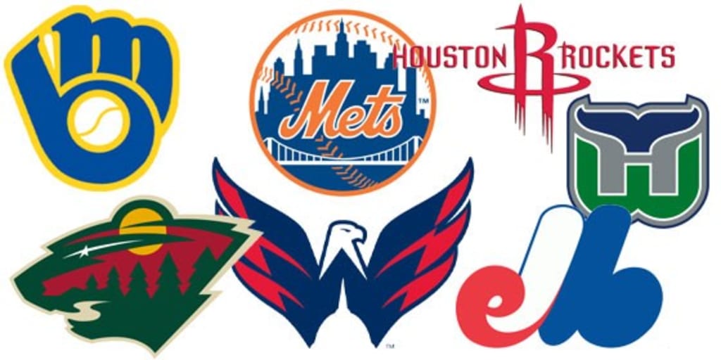
Basketball brands pivot faster than a point guard. When the Golden State Warriors crossed the Bay Bridge in 2019, they updated their logo to spotlight the span itself, replacing the generic “San Francisco” wordmark that had felt touristy. The subtle gradient inside the circle mimics Pacific fog rolling in at twilight, a detail only noticeable on 4K broadcasts but endlessly screen-shotted on Reddit. Down in Miami, the Heat’s flaming basketball tilts backward as if launched from South Beach, its black-and-red palette plagiarized from 1980s Nike posters that once papered the city during the cocaine-cowboy era. Designers insist the theft is intentional: Miami, they say, has always recycled danger into glamour.
Hockey, often the coldest sport, produces the warmest emblems. The Chicago Blackhawks’ profile of an indigenous leader survived cancel-culture debates because the club partners with local tribes on educational campaigns, turning a potentially toxic logo into a classroom conversation starter. In Nashville, the Predators’ saber-toothed cat is fossil-grade literal: a 1971 excavation near the city unearthed the skeleton of the extinct Smilodon floridanus. Rather than invent a myth, marketers simply colored the prehistoric skull neon yellow and set it inside a guitar pick, fusing music and mammoths into one civic identity.
Even minor-league baseball participates in semiotic mischief. The Vermont Lake Monsters feature a neon-green Loch-Ness-like creature waterskiing, a logo so absurd it trends on Twitter every August when the Short-Season A team makes its playoff push. Sales of the cap rival those of some MLB clubs, proving that irony can outsell tradition if the joke is local enough.
Color theory anchors these choices. Dallas Cowboys’ navy (“Cowboys Blue”) and silver are Pantone-matched to the exact hues used on 1970s highway signs that guided truckers toward Texas Stadium, subconsciously reminding every fan of Friday-night lights along Interstate 30. Conversely, the Seattle Kraken abandoned maritime navy for deep “ice blue” because Amazon’s campus lighting—LED panels tuned to 6,500 Kelvin—made older blues appear purple on smartphone screens. In the age of Instagram, a hue that looks wrong in selfies dies overnight.
Typography also weaponizes loyalty. The New York Knicks’ modified Bodoni recalls the headlines of the 1946 Daily News that first reported the team’s birth, while the San Antonio Spurs’ spur-shaped U echoes the Alamo’s wrought-iron gates. Both fonts are custom-encoded so that counterfeit T-shirts sold in back-alley markets contain telltale pixelation; leagues hire private detectives to spot the blur and seize fake goods, protecting billion-dollar brands with the same zeal once reserved for steroids.
Yet the most powerful logos escape merch entirely. The Green Bay Packers’ “G” is simplicity itself: a white oval on a dark-green background. It contains no cheese, no bay, no pack of anything. Its power lies in communal equity; fans own the team, so the letter feels like it belongs to every Wisconsin mailbox and barn roof painted on Sunday morning. Likewise, the Los Angeles Lakers’ purple and gold never depict a lake or a Laker; instead the colors reference Minneapolis’ wheat fields and the royalty of Showtime. When the team moved west in 1960, the name became an anachronism, but the palette stayed, proving that pigment can outlive logic.
In the end, American sports logos succeed because they operate like civic tattoos: painful to change, permanent in identity, yet flexible enough to stretch as the body politic grows. They are shorthand for heartbreak and joy, for fathers who once caught foul balls and daughters who now stream games on TikTok. Designers may sketch the first draft, but history finishes the artwork—one stitch, one screenshot, one stadium wave at a time.